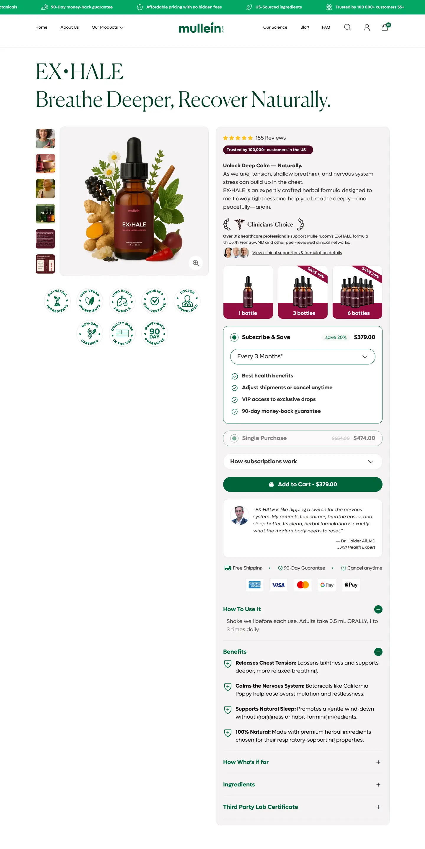
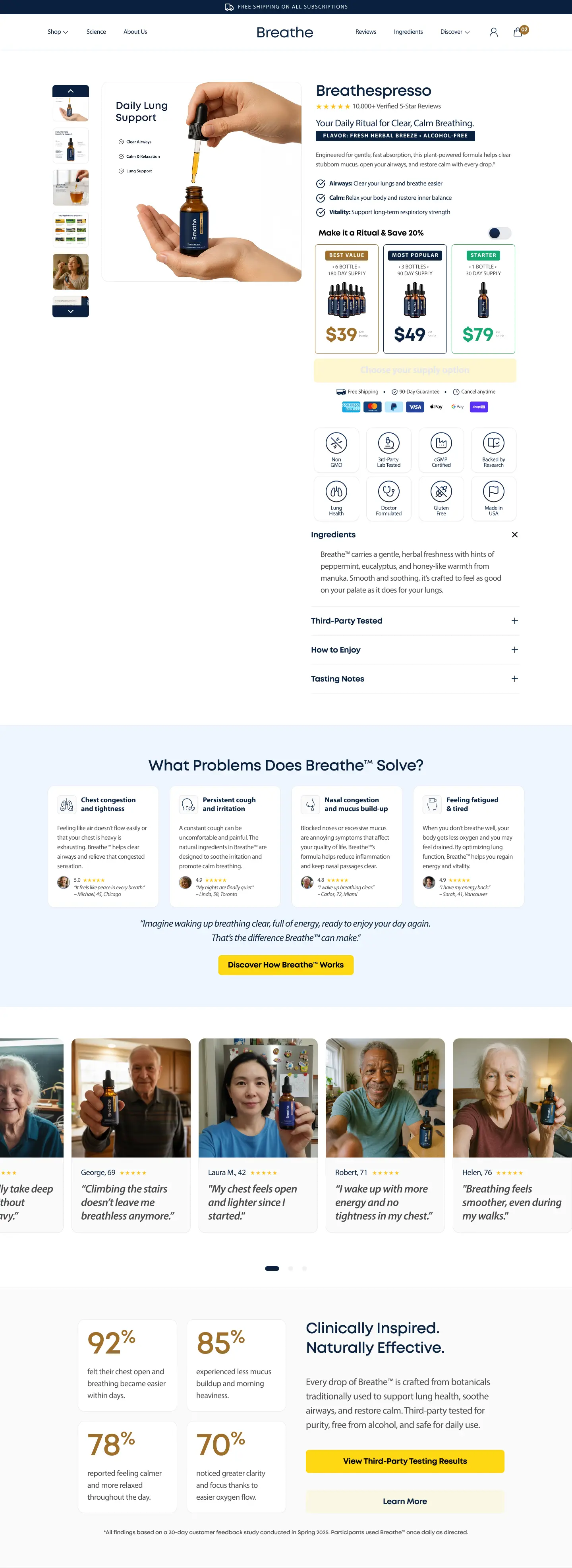
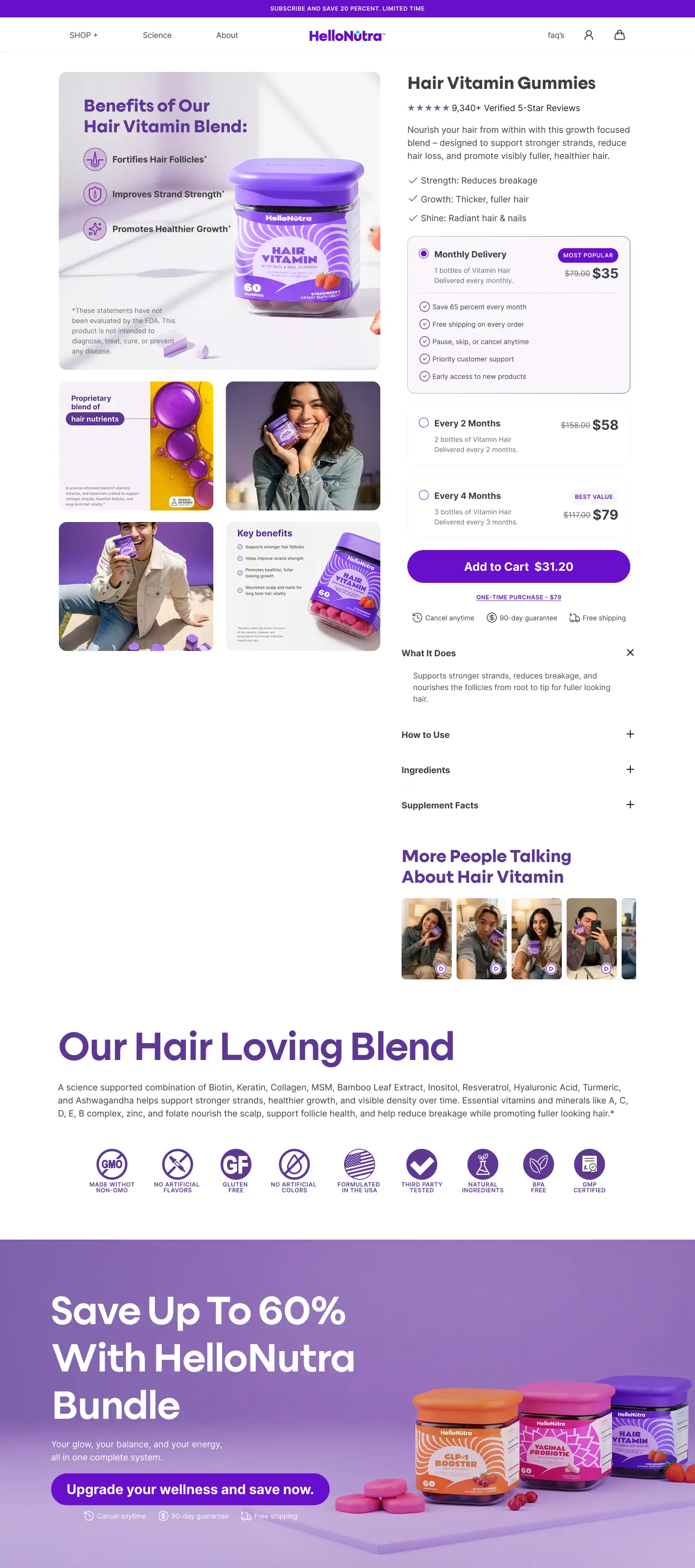
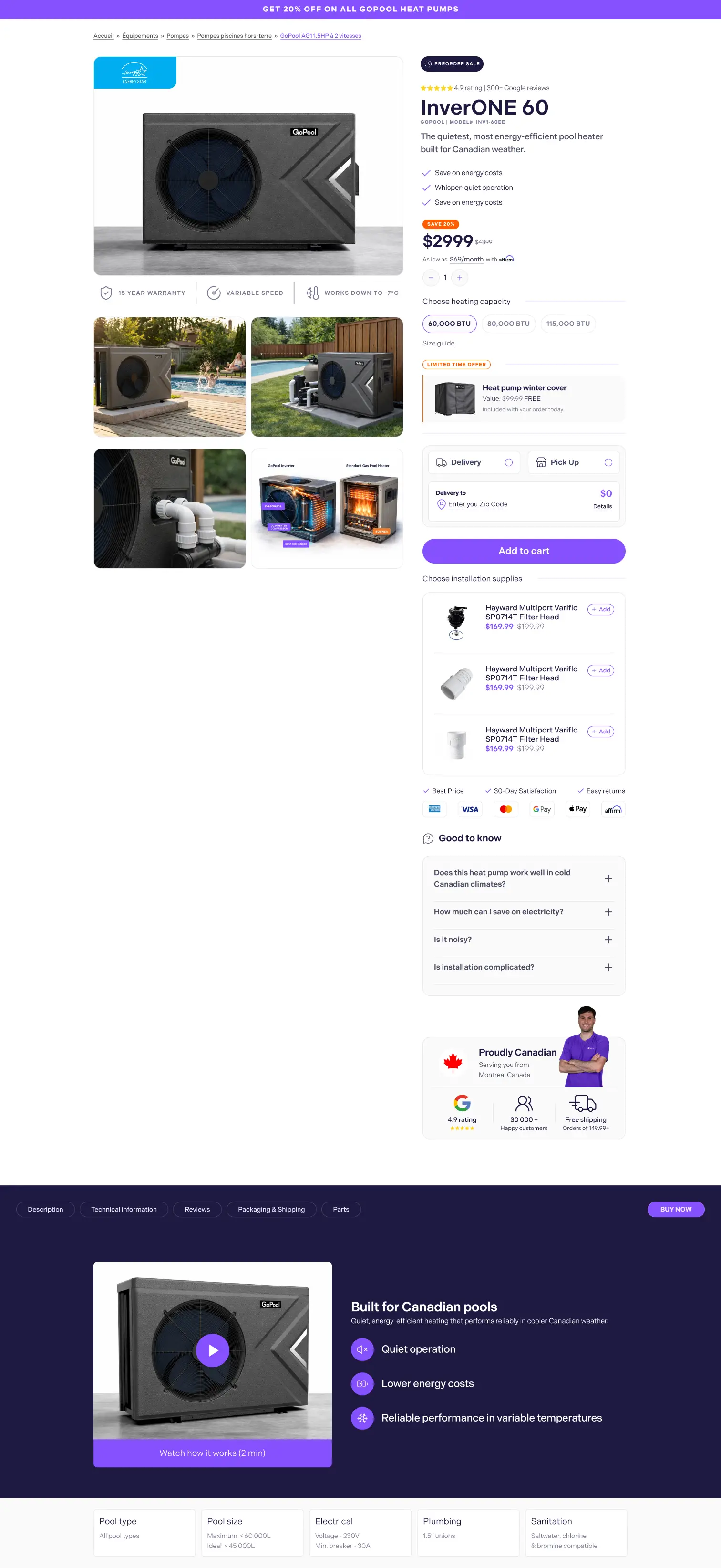
Shopify PDP redesign
GoPool
High-consideration Shopify PDP redesign focused on compatibility clarity, cleaner product page UX, and stronger trust timing before purchase.
View case study
Product Page Design
I design Shopify product pages that help users understand the offer faster, compare with less effort, and move toward purchase with more confidence. The goal is not to add more blocks. It is to structure the PDP around how people actually decide, with stronger product page UX, trust timing, and clearer action hierarchy.
Product page UX · PDP optimization · Trust placement · Mobile conversion
What strong product page design actually does
The page should help users understand the product, confirm fit, and feel safe to buy without forcing them to dig through scattered modules or repeated claims.
Offer clarity
Headline, imagery, pricing, and differentiation are understood faster above the fold.
Decision support
Fit, size, ingredients, specs, or use-case questions are answered before hesitation compounds.
Trust at the right time
Reviews, shipping, returns, guarantees, and reassurance appear where doubt usually starts in the buying flow.
Cleaner action flow
The CTA zone stays focused across desktop and mobile instead of competing with secondary modules before cart and checkout.
Why many Shopify product pages underperform
Product pages usually underperform when every block is trying to persuade at once. Users need sequence, not noise: what this is, why it matters, whether it fits, and why it feels safe to buy now.
The value proposition is vague or delayed
Users scroll before they fully understand what makes the product worth considering.
Too many competing modules
Upsells, badges, bundles, sticky bars, and tabs compete for attention instead of supporting one decision path.
Trust signals appear after the moment of doubt
Reviews, guarantees, and shipping information show up too late to reduce hesitation.
Mobile layouts make action harder
Information gets stacked without rhythm, which slows scanning and weakens purchase momentum.
“Most product page conversion issues are structural, not visual.”
Related PDP resources
Shopify product page examples
A curated look at Shopify PDP examples and what makes product page UX clearer to buy from.
Shopify PDP checklist
A practical checklist for offer clarity, trust, mobile scanning, and product page UX flow.
Product page UX mistakes
Common product page UX issues that slow understanding and weaken buying momentum.
High-converting product page structure
How a product page should be sequenced from first-screen clarity to final reassurance before checkout.
What I improve on Shopify PDPs
Above-the-fold hierarchy
Headline, gallery, price, variants, key benefits, and primary CTA arranged in a clearer buying sequence.
Product information UX
Benefits, features, ingredients, specs, and use-case content grouped around what users need next.
Trust and reassurance placement
Reviews, guarantees, shipping, returns, and proof moved closer to hesitation points.
Variant and bundle UX
Cleaner option selection, quantity logic, subscriptions, bundles, and offer framing for faster conversion decisions.
Mobile PDP UX
Faster scanning, calmer stacking, better sticky CTA behavior, and information pacing that still feels coherent on smaller screens before cart and checkout.
Selected Product Page Design Work
Shopify PDP redesign
High-consideration Shopify PDP redesign focused on compatibility clarity, cleaner product page UX, and stronger trust timing before purchase.
View case study
Multi-SKU PDP system
Product page system designed from zero with stronger education flow, calmer hierarchy, and clearer product differentiation across multiple SKUs for better conversion.
View case study
Supplement PDP UX
Supplement PDP architecture built to organize long-form product education into a clearer product page UX path from understanding to purchase action.
View case study
Figma PDP concept
Hair Vitamin PDP concept in Figma built around product education, offer options, reviews, ingredient credibility, and a trust-led ecommerce purchase flow.
View Figma file
Best fit
Frequently asked questions
Both. Sometimes the PDP is the main bottleneck. In other projects, the product page needs to be redesigned as part of a broader ecommerce UX system.
No. The focus is hierarchy, decision flow, trust placement, and conversion structure, not visual polish alone.
Often yes. Many PDP improvements can be designed within the current store structure, depending on the theme and implementation constraints.
Yes. Product page design is the broader design service. PDP optimization is usually the more audit and conversion-improvement angle. They overlap, but the entry intent is different.
Ready to improve your Shopify product page?
I can review the current product page, identify where momentum breaks, and map a cleaner product page UX path before design execution.