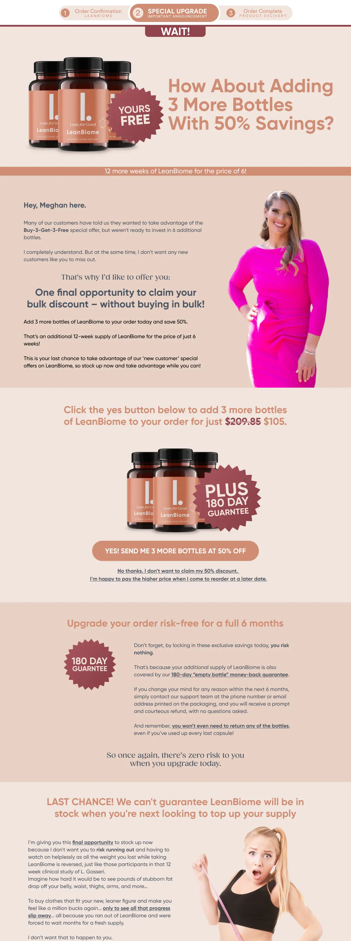
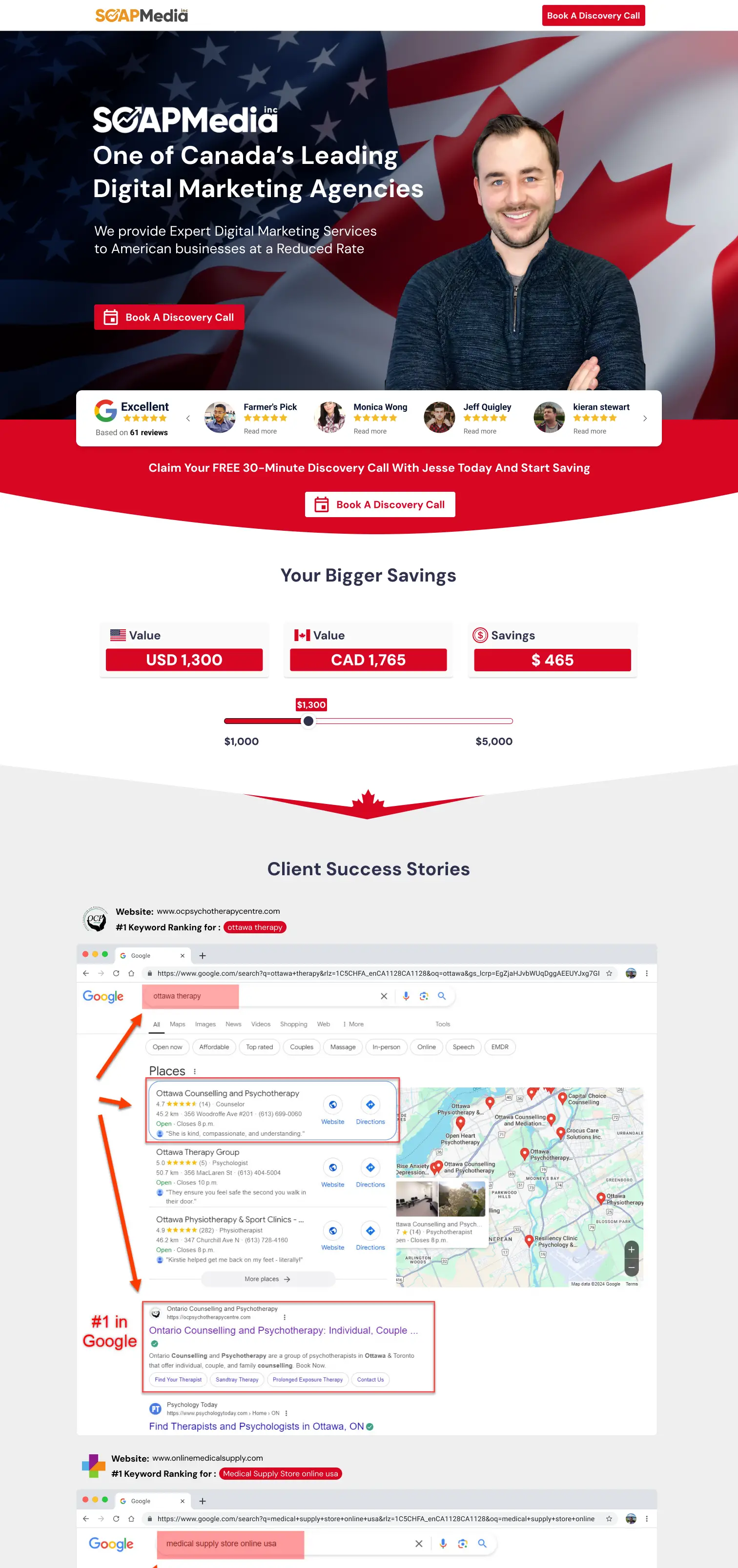
LeanBiome Downsell Page
Post-purchase downsell page designed to recover hesitation with clearer value framing, calmer section flow, and a more decisive recovery CTA.
View related work
Landing Page Designer
I design landing pages for ecommerce offers, lead generation, hybrid pages, upsells, downsells, and long-form sales flows that explain the offer faster, sequence proof more effectively, and create cleaner CTA momentum from first screen to final action.
Many landing pages look polished but still make users work too hard to understand the promise, trust the offer, or know what to do next.
Clarify what the page is selling, who it is for, and why it matters before attention drops.
Place proof, reassurance, and credibility where hesitation naturally starts to form.
Build a cleaner path from message to action so the page feels easier to move through.
What’s included in landing page design
The goal is to structure the page so users understand the message, believe the offer, and move toward inquiry or purchase with less friction.
Message hierarchy
Headline, subhead, and support blocks structured so users grasp the main idea immediately.
Proof timing
Testimonials, logos, guarantees, and trust cues placed where the page needs support most.
CTA structure
Primary actions spaced and emphasized so the next step feels obvious instead of forced.
Mobile readability
Tighter visual grouping and cleaner scanning patterns for smaller screens where drop-off compounds faster.
One coherent path
The page is built as a progression, not a collection of disconnected sections competing for attention.
Selected landing page projects
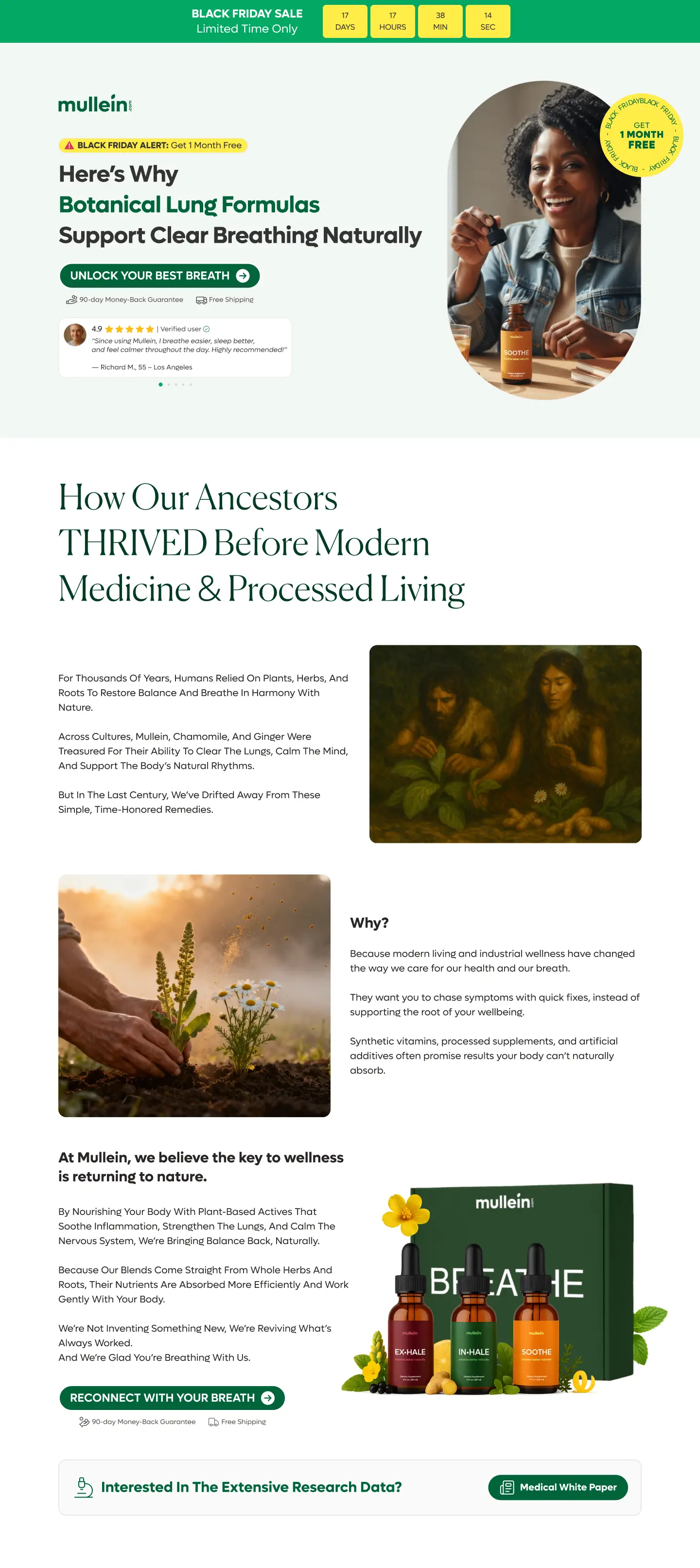
Post-purchase downsell page designed to recover hesitation with clearer value framing, calmer section flow, and a more decisive recovery CTA.
View related work
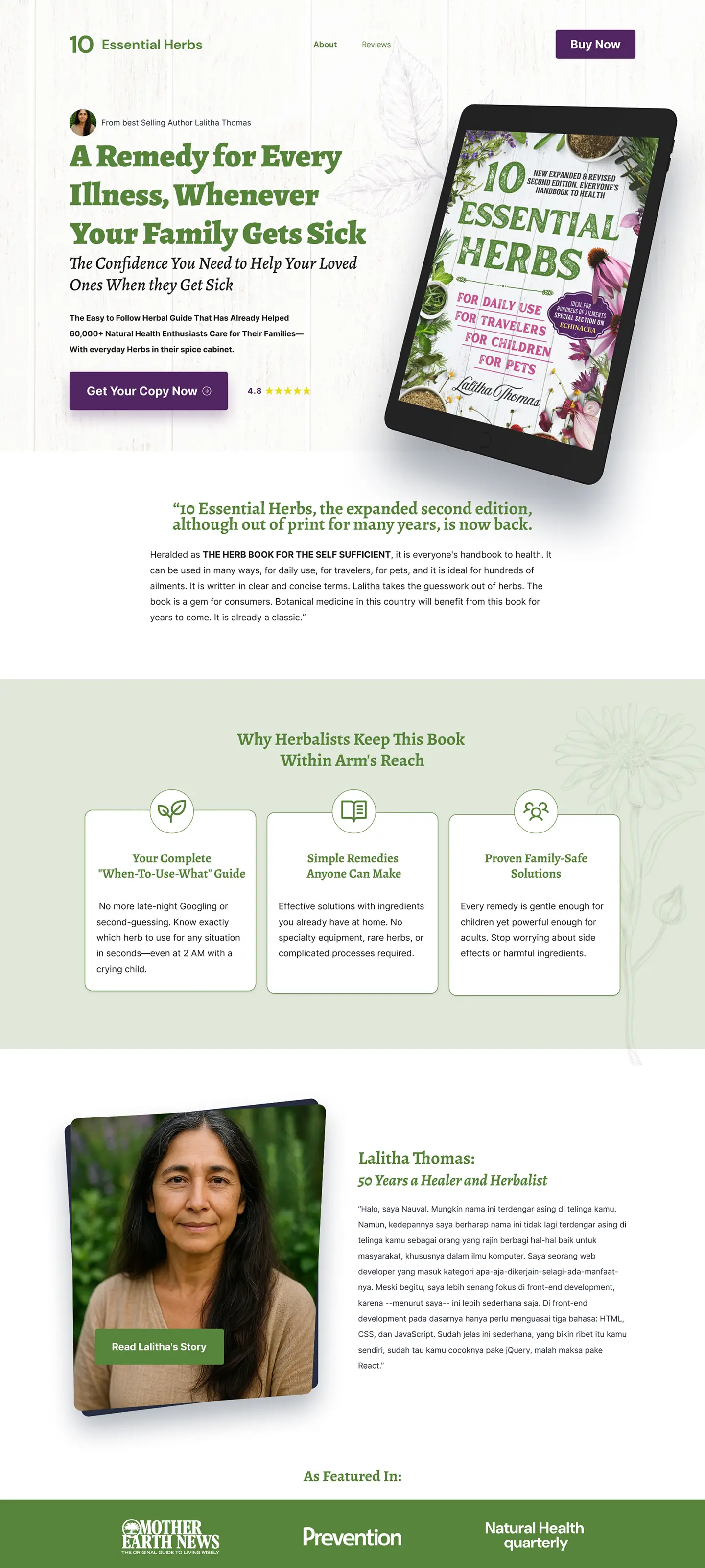
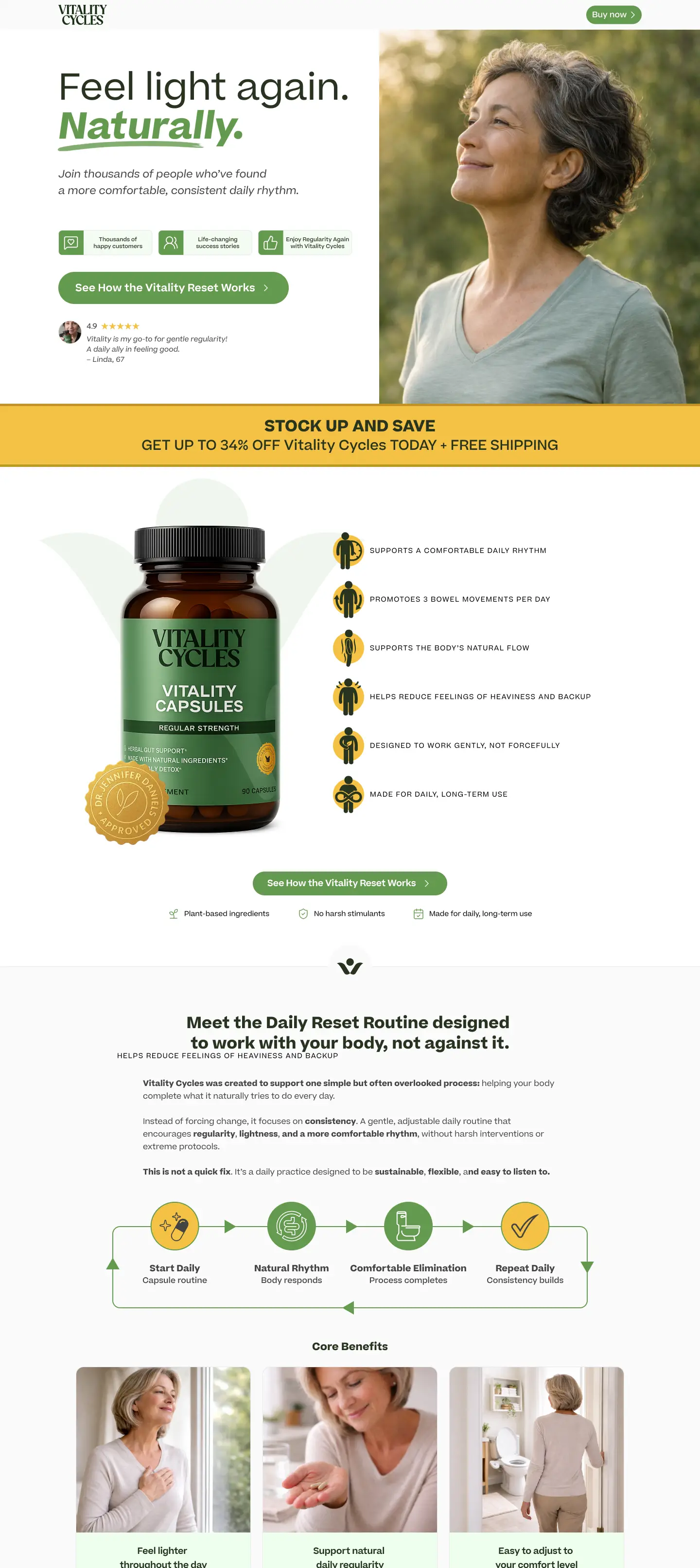
Supplement landing page designed to tighten product education, clarify the promise earlier, and support conversion with a calmer proof-to-CTA flow.
View related work
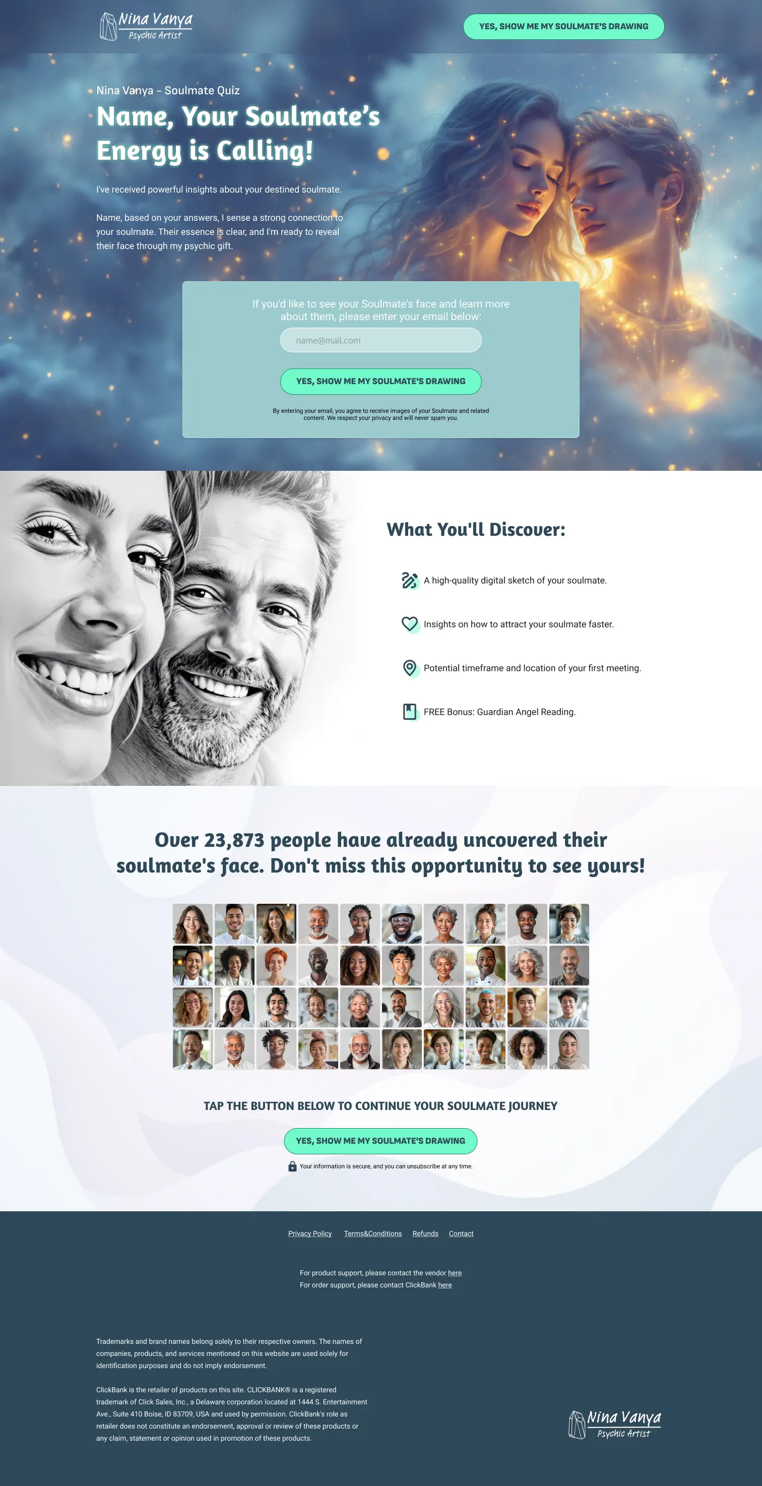
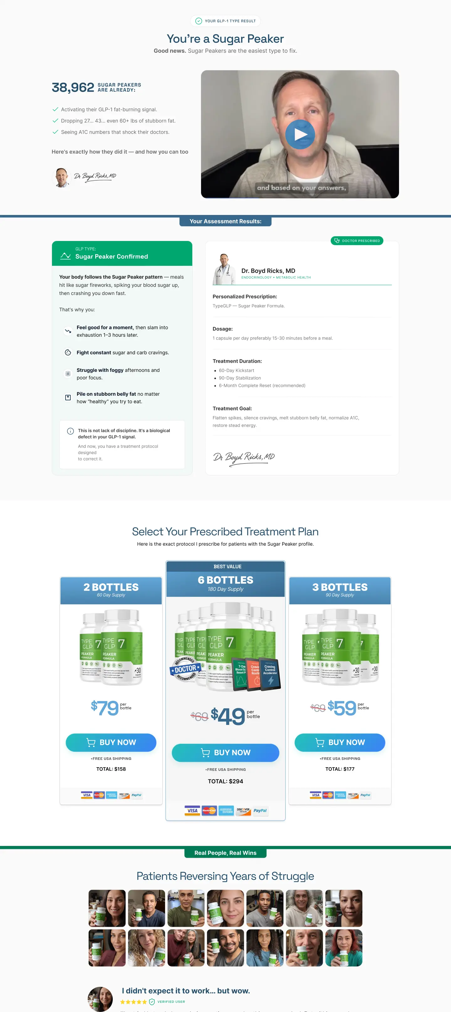
Landing and upsell flow built to keep emotional momentum after the first decision with stronger post-quiz continuity, trust support, and CTA pacing.
View related work
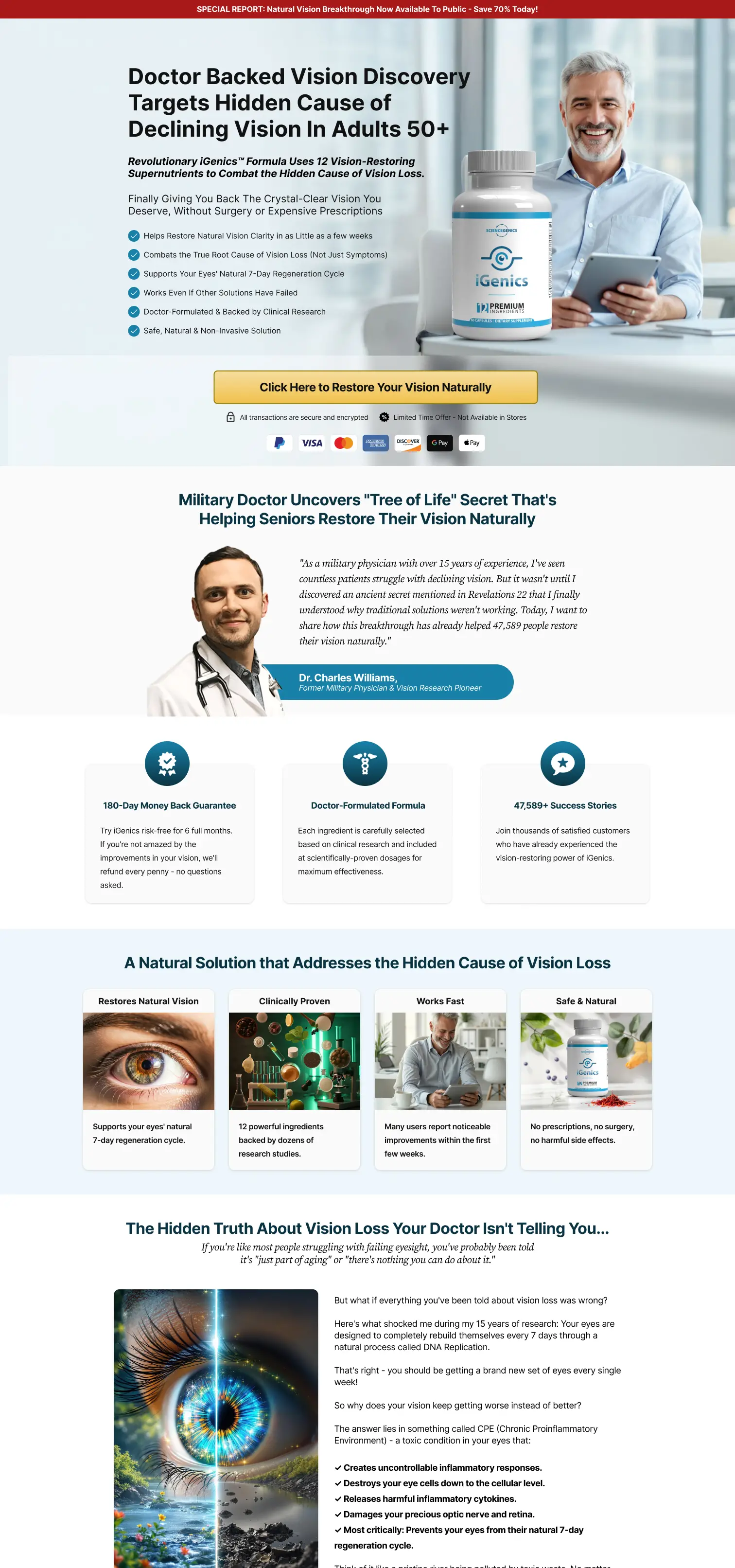
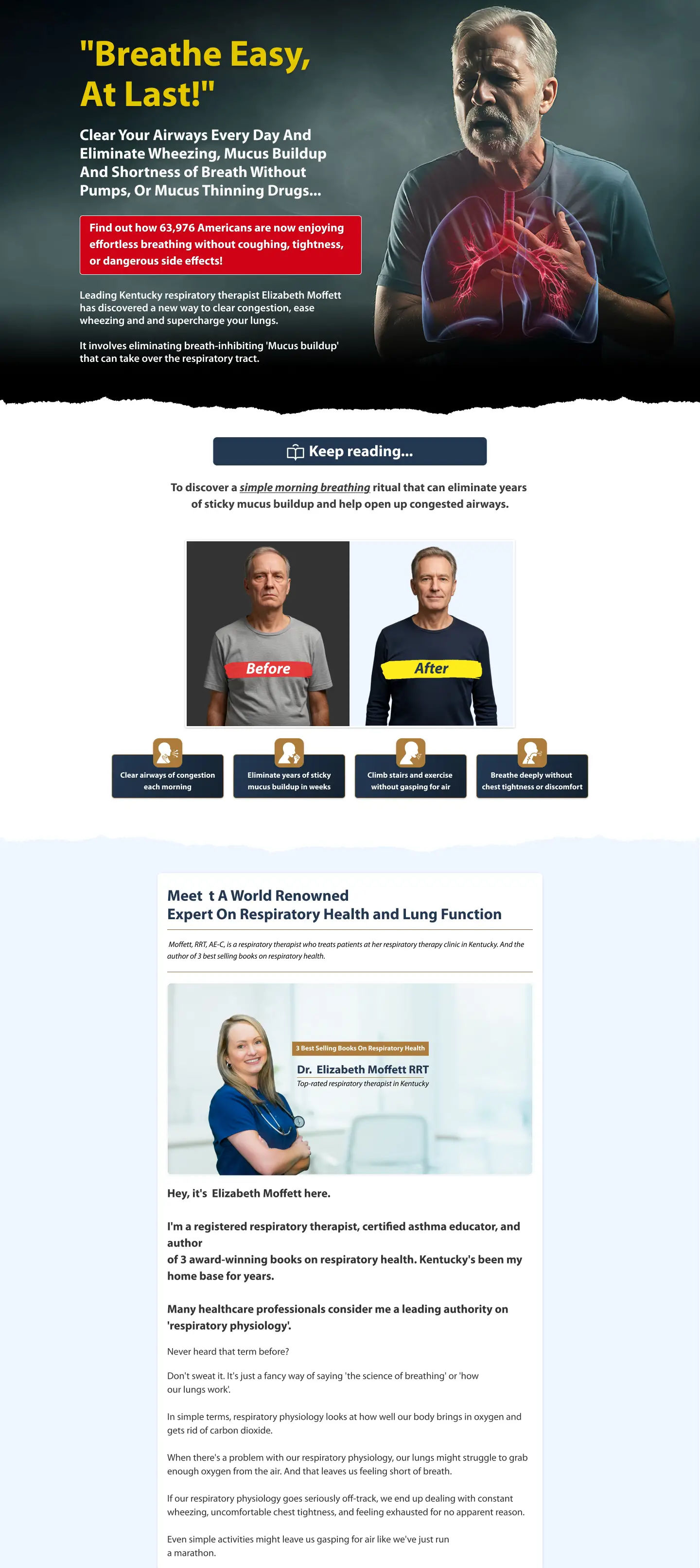
Hybrid sales landing structured to balance education, persuasion, and conversion momentum without collapsing into one long undifferentiated scroll.
View related work
Shopify landing page designed for cleaner feature framing, tighter section pacing, and a stronger path from first-screen product story to action.
View related work
Conversion landing created to simplify benefit scanning, reduce friction in longer sections, and keep the offer readable through a more controlled rhythm.
View related work
Campaign landing page designed around promotional urgency, cleaner offer hierarchy, and a faster path from headline to purchase intent during seasonal traffic spikes.
View related work
TSL page designed to support long-form persuasion with clearer narrative blocks, steadier proof pacing, and more deliberate CTA intervals.
View related work
Service-led landing page design with clearer service framing, proof sequencing, and tighter CTA rhythm.
View related work
I can help identify where the message, trust, and CTA flow are making the page harder to act on than it should be.