Transformation story
A technical catalog became a clearer buying path.
GoPool sells expensive products with real spec complexity. The redesign focused on helping users understand differences before commitment.
Before
Product value was real, but the path to understanding it felt heavier than it should.
Decision
Rebuild the journey around orientation, comparison, and guided product evaluation using the GoPool design system.
After
The site reads more like a selection system and less like a flat inventory layer.
The homepage showed information, but not a decision path.
The old entry point asked users to process too much structure before enough clarity existed.
- Problem
- Buyers had to decode categories, product logic, and next steps too early.
- Why it matters
- For a technical purchase, weak orientation increases bounce and delays comparison.
- Decision
- Restructure the entry hierarchy to set up category navigation before model comparison begins.
- Result
- The redesign creates a cleaner first read and a more direct path into discovery.

Navigation had to explain the product universe first.
- Problem
- Menu structure exposed options, but did not explain where to begin.
- Why it matters
- If entry logic is unclear, every downstream screen works harder than necessary.
- Decision
- Rework grouping, labels, and category exposure inside a real mobile menu flow.
- Result
- Users can enter the catalog with intent instead of opening and scanning blindly.
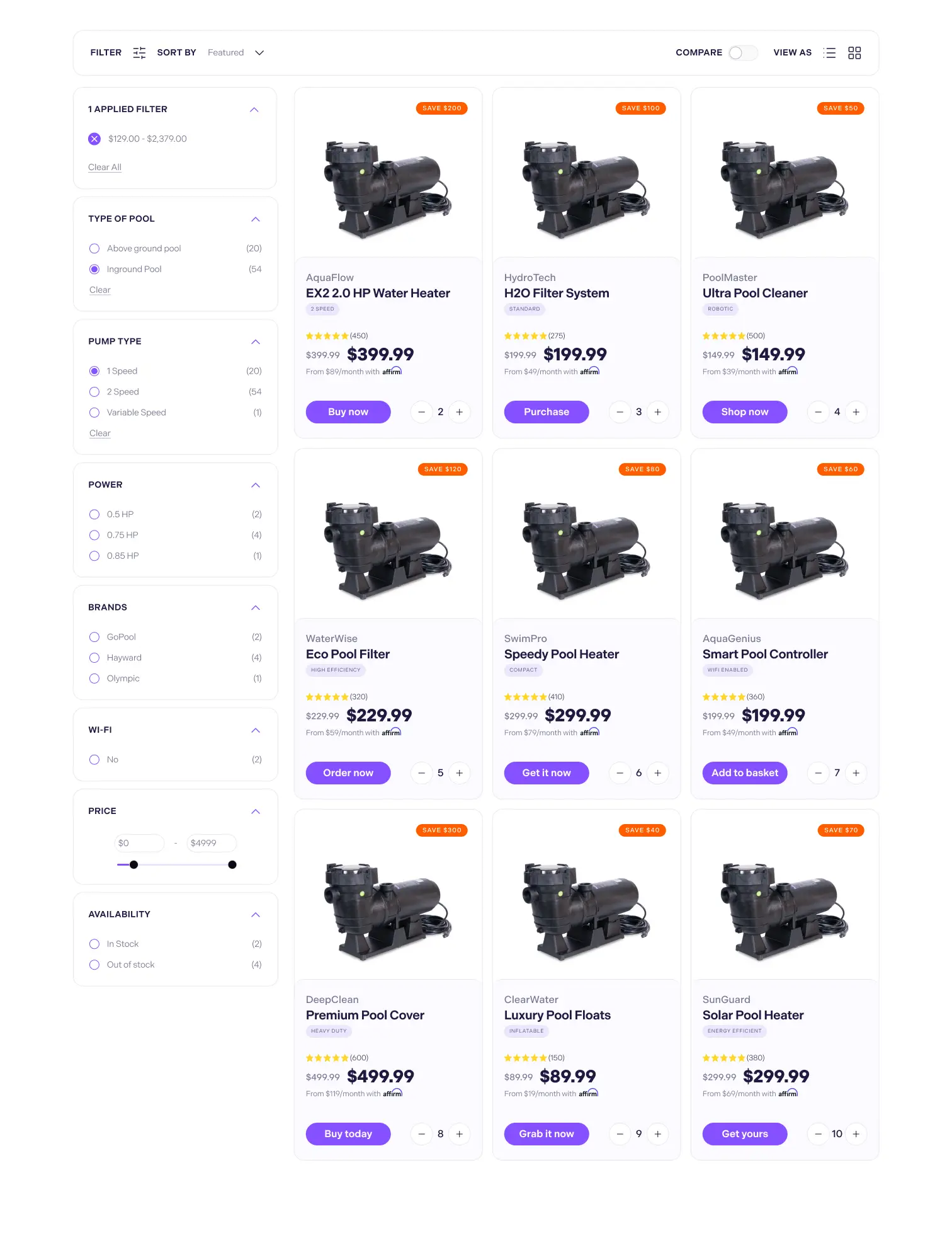
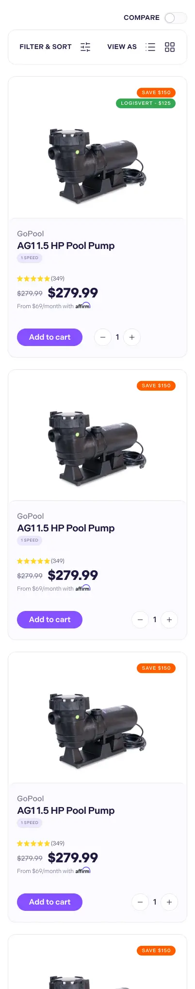
The collection page had to help users shortlist sooner.
Desktop carries the structural comparison. Mobile shows how the hierarchy collapses in context.
- Problem
- The grid made meaningful model differences feel flatter than they were.
- Why it matters
- Buyers need shortlist confidence before they invest energy in a PDP.
- Decision
- Redesign the PLP around faster scan rhythm, stronger product separation, and clearer evaluation cues.
- Result
- The collection layer now helps users narrow options instead of just exposing inventory.

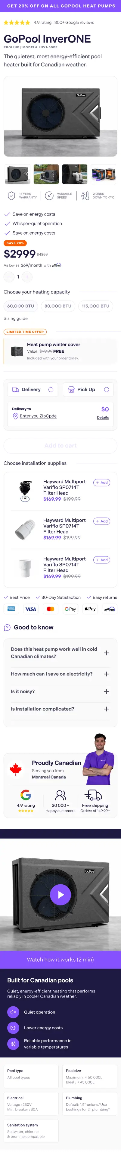

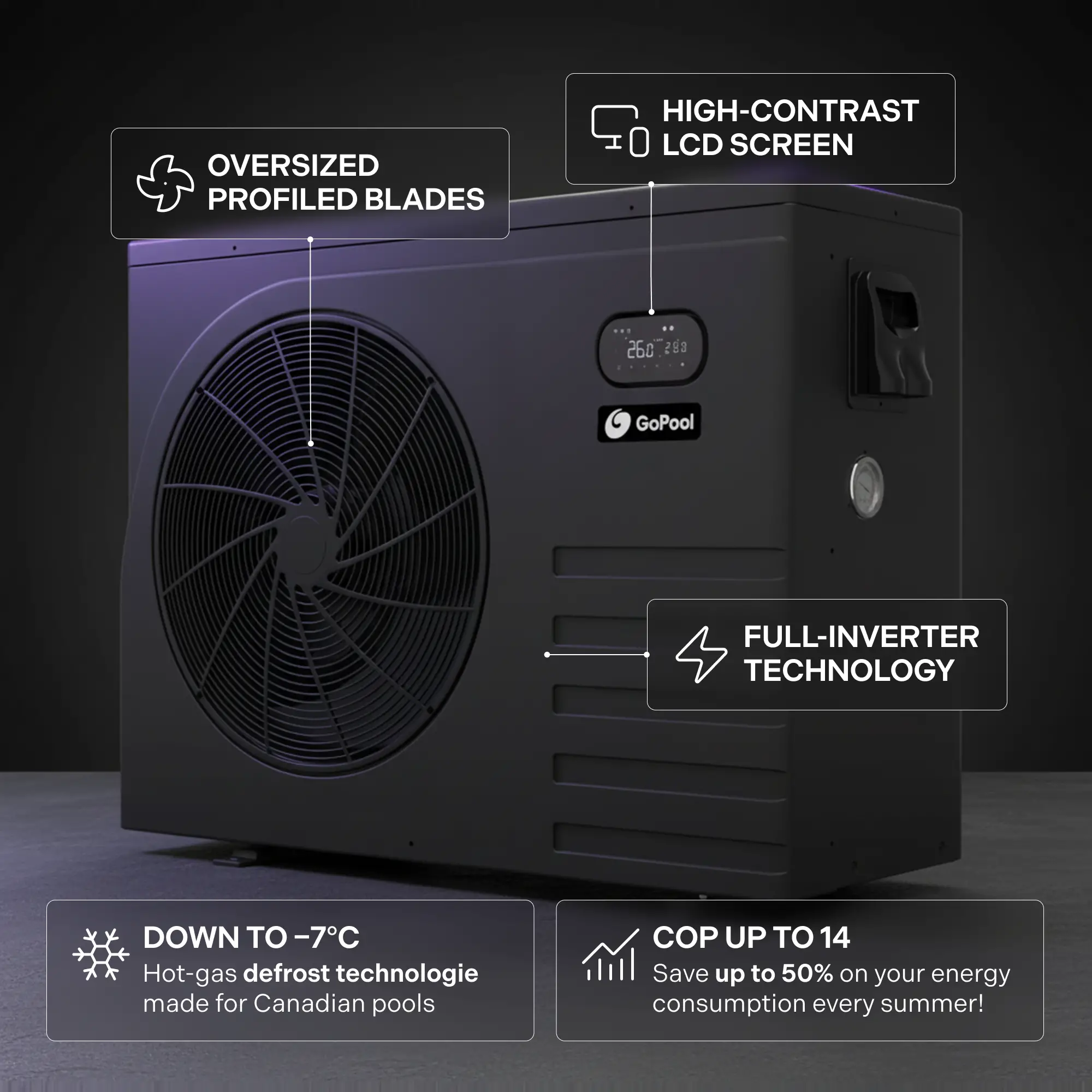
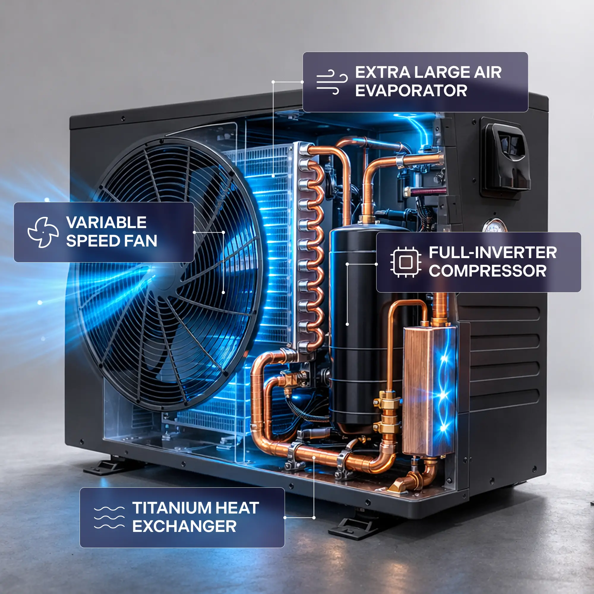
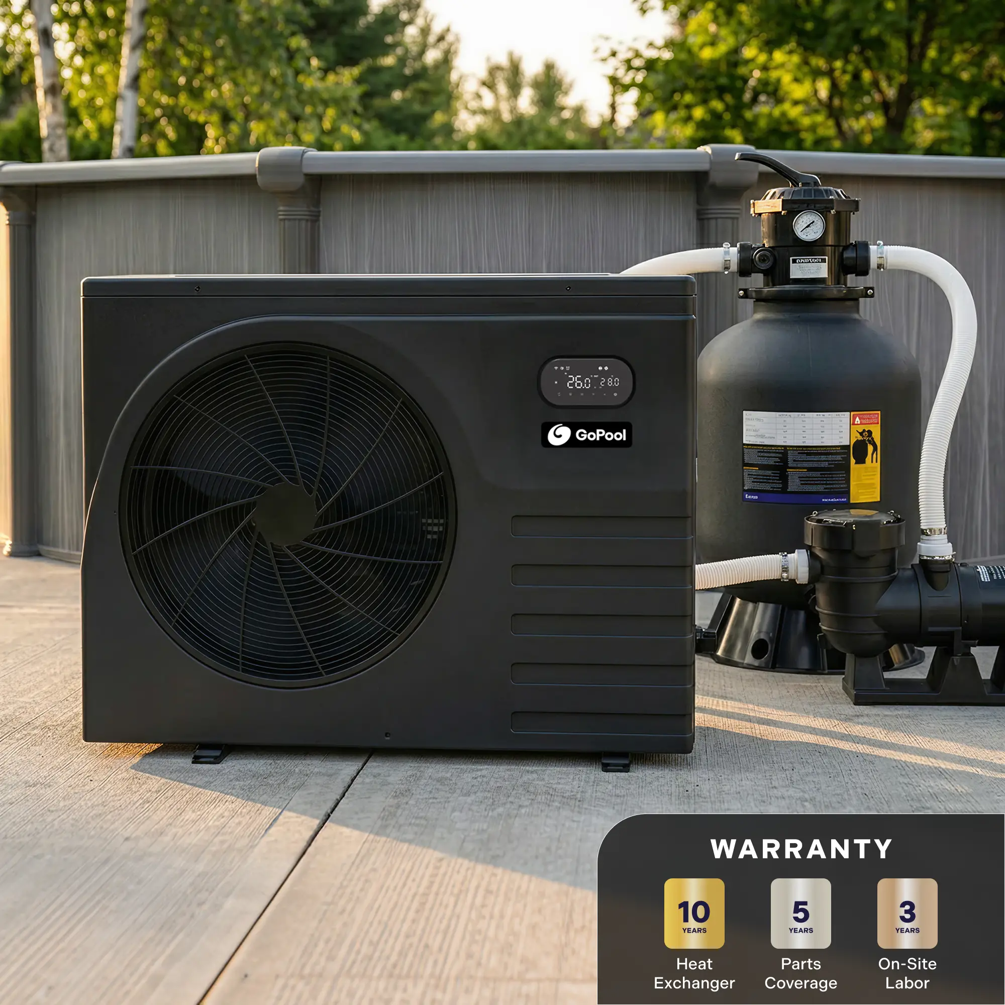
The PDP entry had to feel guided, not dense.
- Problem
- Product identity, specs, and action competed too early in the old flow.
- Why it matters
- High-consideration PDPs fail when the first screen feels like work.
- Decision
- Lead with a stronger desktop PDP and support it with focused mobile purchase states.
- Result
- Users get clearer product context before they are asked to commit.
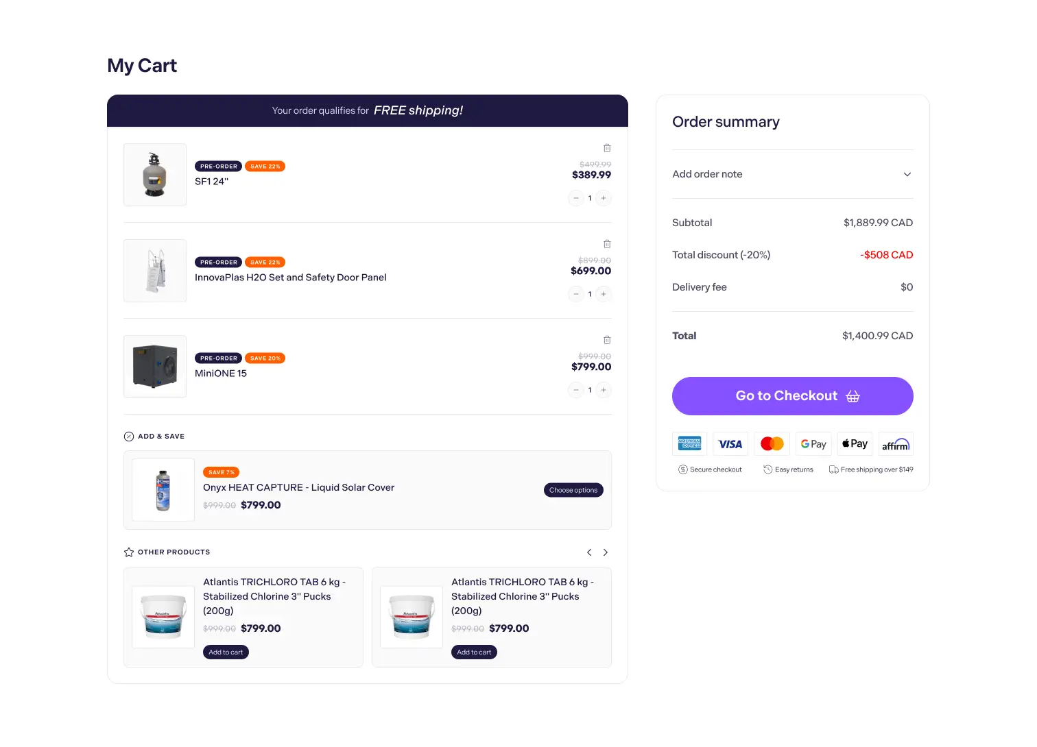
This is the moment where the user commits to purchase.
- Problem
- Bundle choice, add-ons, and cart action can feel abrupt when they arrive without clear hierarchy.
- Why it matters
- This is where hesitation turns into purchase or drop-off, so pricing and upsell logic must read fast.
- Decision
- Use mobile as the focal proof for bundle selection, add to cart, and add-on logic, with desktop as supporting context.
- Result
- The purchase step feels structured, legible, and ready to commit instead of feeling like a last-minute upsell.
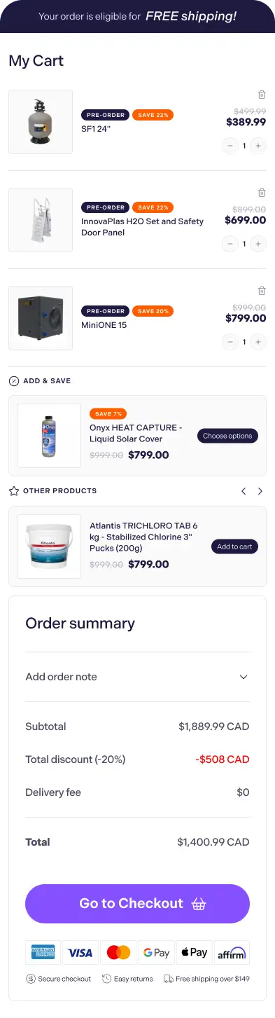
Purchase flow had to stay clear after the PDP.
Cart structure matters because uncertainty often returns once users move into checkout intent.
- Problem
- Added-to-cart states can feel abrupt if summary and confirmation are weak.
- Why it matters
- Buyers need the next step to feel stable, not like a context switch.
- Decision
- Pair the desktop cart with a real mobile preview and one detail crop.
- Result
- The purchase path stays coherent after product evaluation, not just before it.
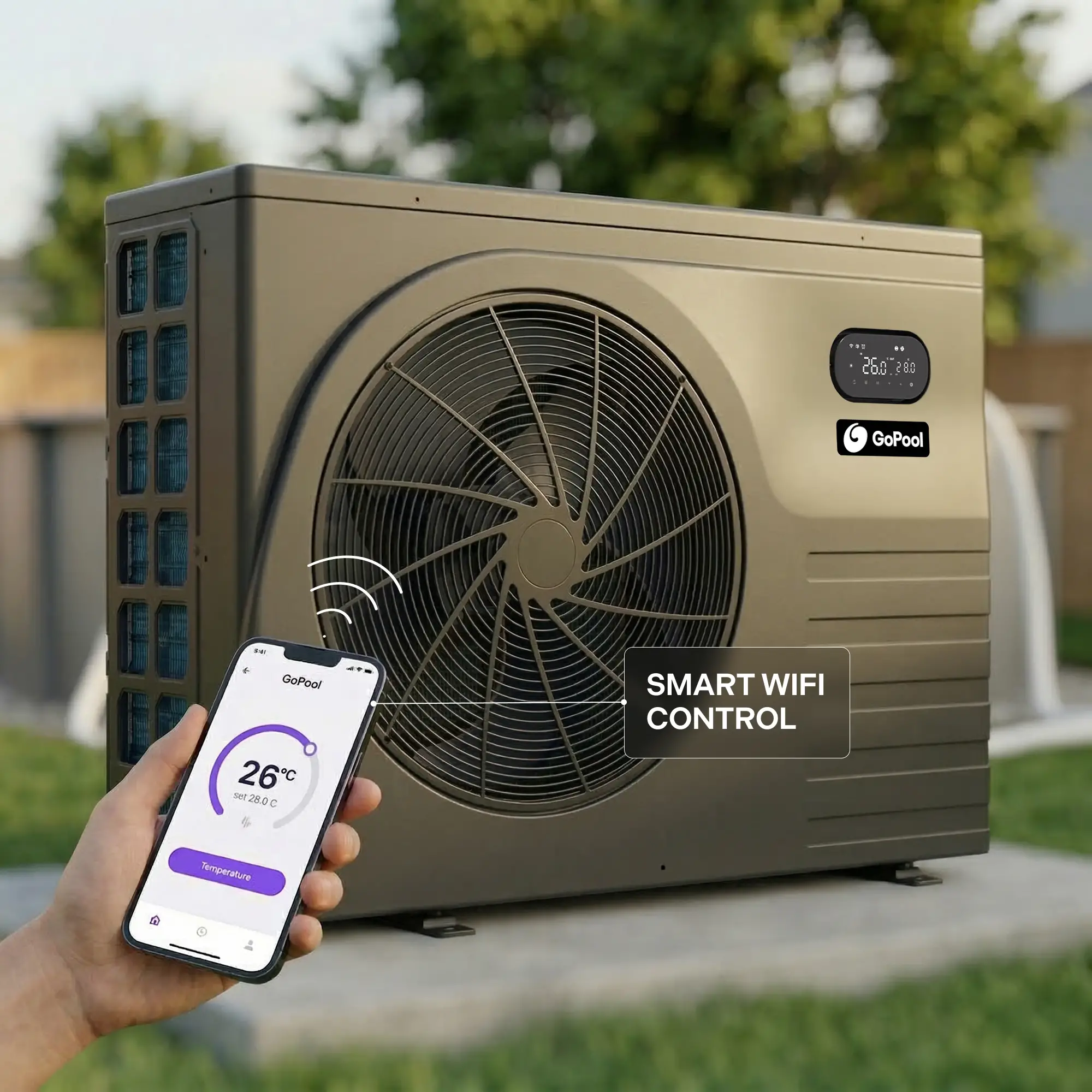
Features / support
Supporting content became decision support.
Final section
A clearer path from discovery to purchase.
The redesign did not simplify the product. It simplified how the product is understood.
Problem
The original experience made users do too much interpretation on their own.
Why it matters
Technical ecommerce converts better when clarity arrives before persuasion.
Decision
Align homepage, navigation, PLP, PDP, and cart around one decision rhythm.
Result
The full journey supports faster understanding, cleaner comparison, and stronger purchase readiness.
Built to reduce comparison friction before the CTA asks
for commitment.
UI system used across navigation, collection, PDP, and action zones ·
2026
Color System
Core
Highlight
Surface
Use Case
Display · Indivisible
Clear hierarchy.
Less technical drag.
Faster model
choice.
UI · Plus Jakarta Sans
ABCDEFGHIJKLMNOPQRSTUVWXYZ
abcdefghijklmnopqrstuvwxyz
0
1 2 3 4 5 6 7 8 9
Navigation, filters, specs, and CTA layers are designed to reduce interpretation
load before the purchase decision.
Good ecommerce UI does not hide technical
complexity.
It organizes it so the decision feels easier.