Offer continuity
Kept the value story aligned from one step to the next.
Case 10 · Funnel Systems · 2026
A conversion system designed to improve clarity, reduce friction, and increase purchase momentum.
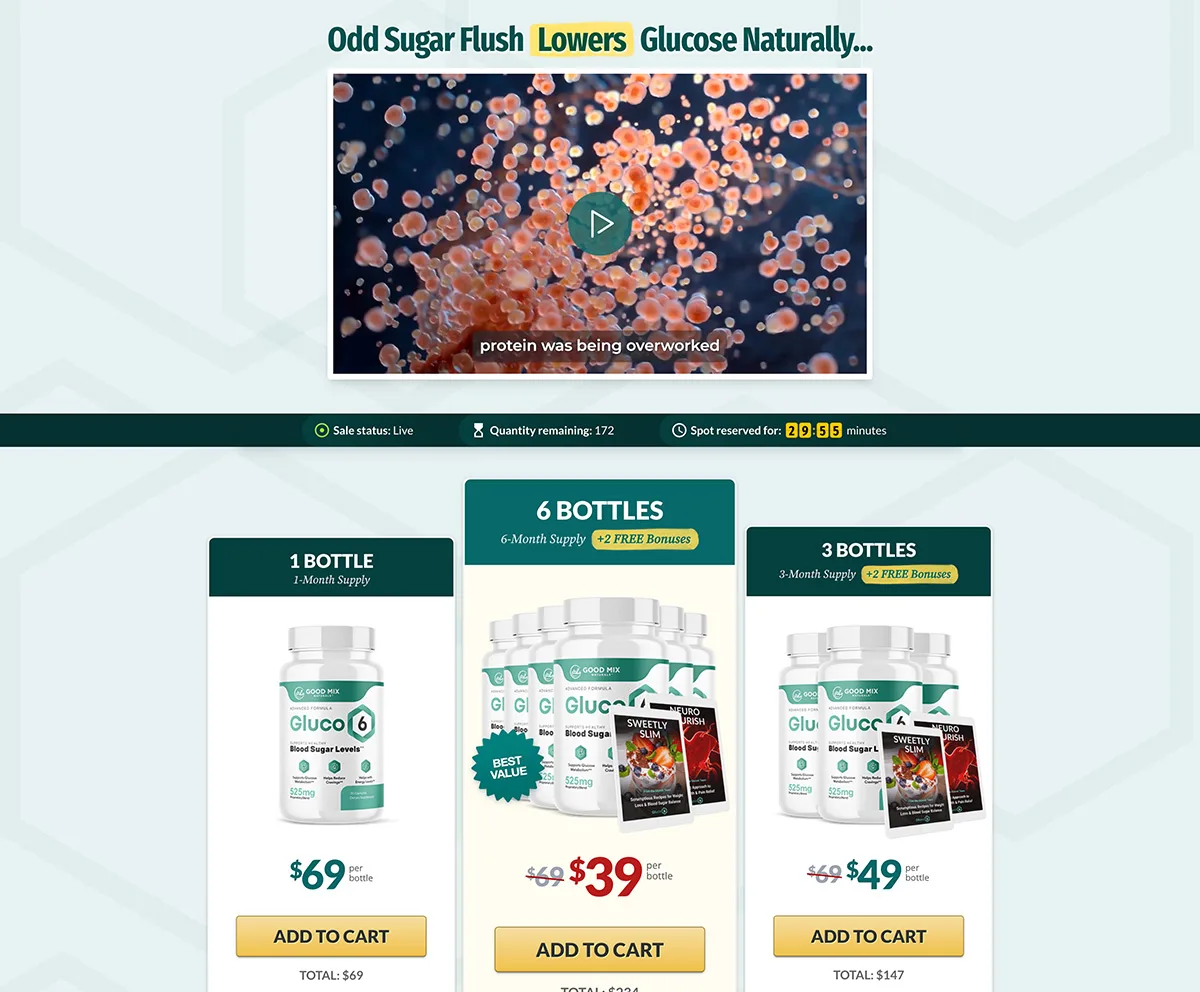
Conversion-focused glucose supplement funnel with streamlined page hierarchy and post-click continuity.
The Challenge
Conversion-focused glucose supplement funnel with streamlined page hierarchy and post-click continuity.
Why this matters: full-funnel systems underperform when every page feels like a new pitch.
Reference links
Transition Strategy
The system had uneven hierarchy and weak decision sequencing, creating hesitation before conversion events.
Designed to help users keep confidence as the funnel shifts from persuasion to purchase to post-purchase.
Offer continuity
Kept the value story aligned from one step to the next.
Decision support
Made each stage answer the next buyer question more clearly.
Trust by intent
Adjusted reassurance to the specific mindset of each step.
Transition clarity
Reduced friction at the points where users are most likely to reset.
System Thinking
Why this matters: conversion improves when the funnel behaves like one connected system instead of isolated page wins.
Funnel strategy
Restructured hierarchy, clarified offer flow, and aligned proof and CTA timing across the journey so each step reinforces the next decision.
Frameworks applied
Transition Logic
Helps users keep momentum even when the funnel changes format, depth, or pressure.
Repeated structural anchors
Kept interaction patterns familiar from one stage to the next.
Offer progression
Made each next step feel like a logical continuation, not a reset.
Intent-matched reassurance
Placed trust based on the mindset of that specific step.
Lower-friction transitions
Clarified what changed, why it matters, and what to do next.
Why this matters: the strongest funnel systems reduce friction between stages, not only inside each page.
Problem: Users lose momentum when every step feels disconnected from the last one.
Design action: Aligned hierarchy, CTA logic, and offer framing across stages.
Why it matters: Continuity lowers friction and keeps confidence moving forward.
Problem: The same reassurance does not work equally well at every stage.
Design action: Adjusted proof and reassurance to the mindset of each step.
Why it matters: Trust performs better when it answers the doubt users have right now.
Problem: Jumps between persuasion, transaction, and post-purchase can feel abrupt.
Design action: Added clearer structural cues and progression logic between steps.
Why it matters: Users act faster when each new page feels expected and easier to understand.
Problem: Post-purchase offers can feel like pressure if continuity breaks.
Design action: Kept offer framing and action hierarchy more consistent after the core sale.
Why it matters: Better continuity improves acceptance without making the funnel feel heavier.
Decision Flow
Why this matters: every new stage needs to feel like a continuation of the same decision, not a new beginning.
01
HOME
Homepage
02
UP2
Upsell
Expected Impact
No fake metrics. The expected impact is framed around continuity, clarity, and stronger step-to-step confidence.
Conversion clarity
Sales Page → UP2 sequence
Observed business impact
Strategic improvement
Data note
Hard performance metrics were not publicly documented. Impact is described through the funnel logic the system was designed to strengthen: continuity, trust timing, and conversion readiness.
Related services
Next Steps
If your pages look good but still underperform, I can audit the flow, clarify the structure, and define a cleaner path before design execution.
Typical response within 24h