01
DISCOVERY
Deep categories slowed high-intent shoppers before they reached a product.

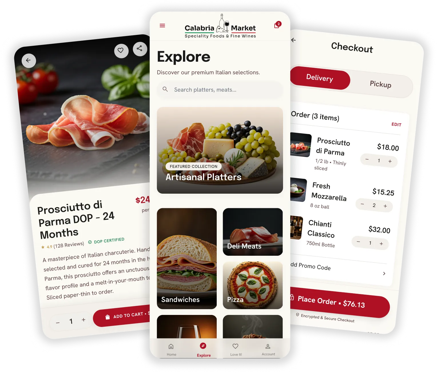

From local grocery shopping to one connected product flow.
ROLE
Product Design · UX/UI
PLATFORM
Mobile commerce
FOCUS
Discovery → Fulfillment
YEAR
2026
01
The existing experience supported the core commerce tasks, but context was lost between them. Discovery, configuration, fulfillment and post-purchase states behaved like separate features, forcing customers to reinterpret the journey at each step. The redesign reframed the app around continuity rather than feature boundaries.
01
Deep categories slowed high-intent shoppers before they reached a product.
02
Variants, customization and pricing were not clear at the moment of choice.
03
Pickup, payment and order status felt like disconnected operational steps.
Ready-made and configurable products coexist in the same shopping journey.
Weight, quantity and preparation choices add configuration before cart.
Availability, date and time affect whether the order can be completed.
02
The redesign treats commerce as a sequence of dependent decisions rather than a stack of screens. Each stage answers a specific user question, preserves prior context and surfaces constraints before they can become downstream surprises.
01
Search and browse
02
Product + variants
03
Deli and quantity
04
Pickup + time
05
Fast checkout
06
Track + loyalty
01
High-intent shoppers had to navigate deep categories.
Prioritize intent before taxonomy.
Search and direct entry points surface products earlier.
02
Fulfillment appeared as a late operational step.
Treat pickup as part of the purchase decision.
Method, date and time are resolved before payment.
03
The journey ended too abruptly after checkout.
Extend the experience beyond payment.
Order status, notifications, support and loyalty remain connected.
03
The product experience was designed around real states, not only polished happy-path screens. Selection, fulfillment, payment, notifications, recovery and support all share the same order context, so the app behaves like one product even when the journey changes direction.
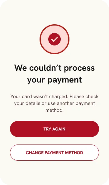
Failure states keep the shopper moving instead of ending the journey.
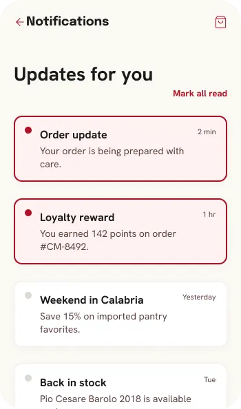
Notifications make fulfillment status visible after checkout.
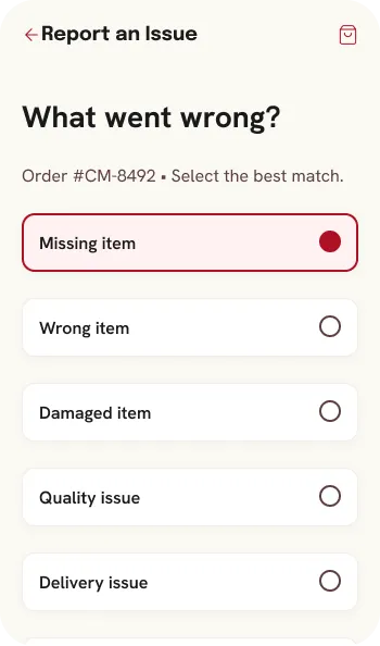
Issue reporting gives customers a clear path when fulfillment breaks.
Product selection, customization, fulfillment choices and order status remain connected as the user moves forward. That continuity reduces repeated decisions and keeps the interface understandable across browsing, checkout and post-purchase. It is also what turns a set of mobile screens into a coherent product model.
04
The product challenge was not to remove complexity, but to place it in the right moment. The redesign makes product options, fulfillment rules and recovery states visible when they become relevant, so shoppers do not have to remember rules, reconstruct context or discover critical constraints at the end.
01
Reduce time-to-product
Global search and clearer browsing prioritize intent over deep category navigation.
02
Reduce decision ambiguity
Variants, quantity and pricing stay visible at the point where customers compare options.
03
Reduce checkout surprises
Pickup method, date and time are treated as core order decisions before the final payment step.
04
Reduce uncertainty after checkout
Tracking, notifications, recovery states and support extend the product beyond the receipt.
05
The visual system was built to support repeatable product behavior, not only visual consistency. Typography, spacing, controls, status patterns and selection states create a shared language for browsing, configuration, fulfillment and checkout, making future flows easier to design and build.
Burgundy
#AF1124
Brown
#5B403F
Gold
#C5A059
Ink
#1B1C19
Cream
#FBF9F4
Warm
#F2EFE9
Success
#006D34
Display / Epilogue Bold
Taste of Calabria
H1 / Epilogue SemiBold
Fresh from the market
H2 / Hanken Bold
Popular near you
Body / Hanken Regular
Premium Italian groceries, prepared food and wine.
Label / Hanken SemiBold
ADD TO CART
8 px
12 px
16 px
Pill
DOP • sliced fresh
06
A usable commerce product has to survive ordinary failure. Payment can fail, pickup availability can change, an order can move through unexpected states, and customers may need help after checkout. These cases were designed as first-class product states so recovery remains clear and the user never loses the order context.
Recover without losing order context.
Explain the constraint and offer the next valid choice.
Keep fulfillment status visible after purchase.
Give customers a direct support path from the order.
07
The result is a clearer mobile product model for the complete customer journey: finding food, configuring products, making confident purchase decisions, scheduling fulfillment, paying, tracking an order, resolving problems and returning through loyalty. The case demonstrates product design across flow architecture, interaction states, edge cases and a reusable UI system, not only screen styling.
Fewer hidden decisions across the purchase journey.
High-intent actions surface earlier in the flow.
Recovery and support states are designed into the product.
A compact component system supports future commerce flows.
Next project
Next project: Your Collagen Source